99%
Ch
UI/UX Design

Dr.Talk Online Learning Medical Platform

Overview
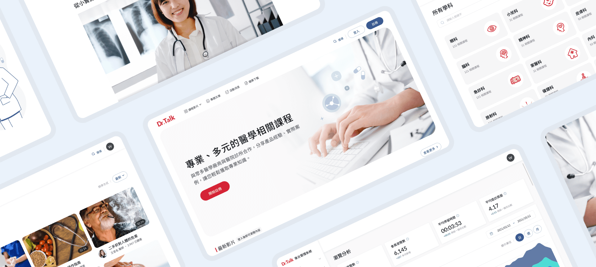
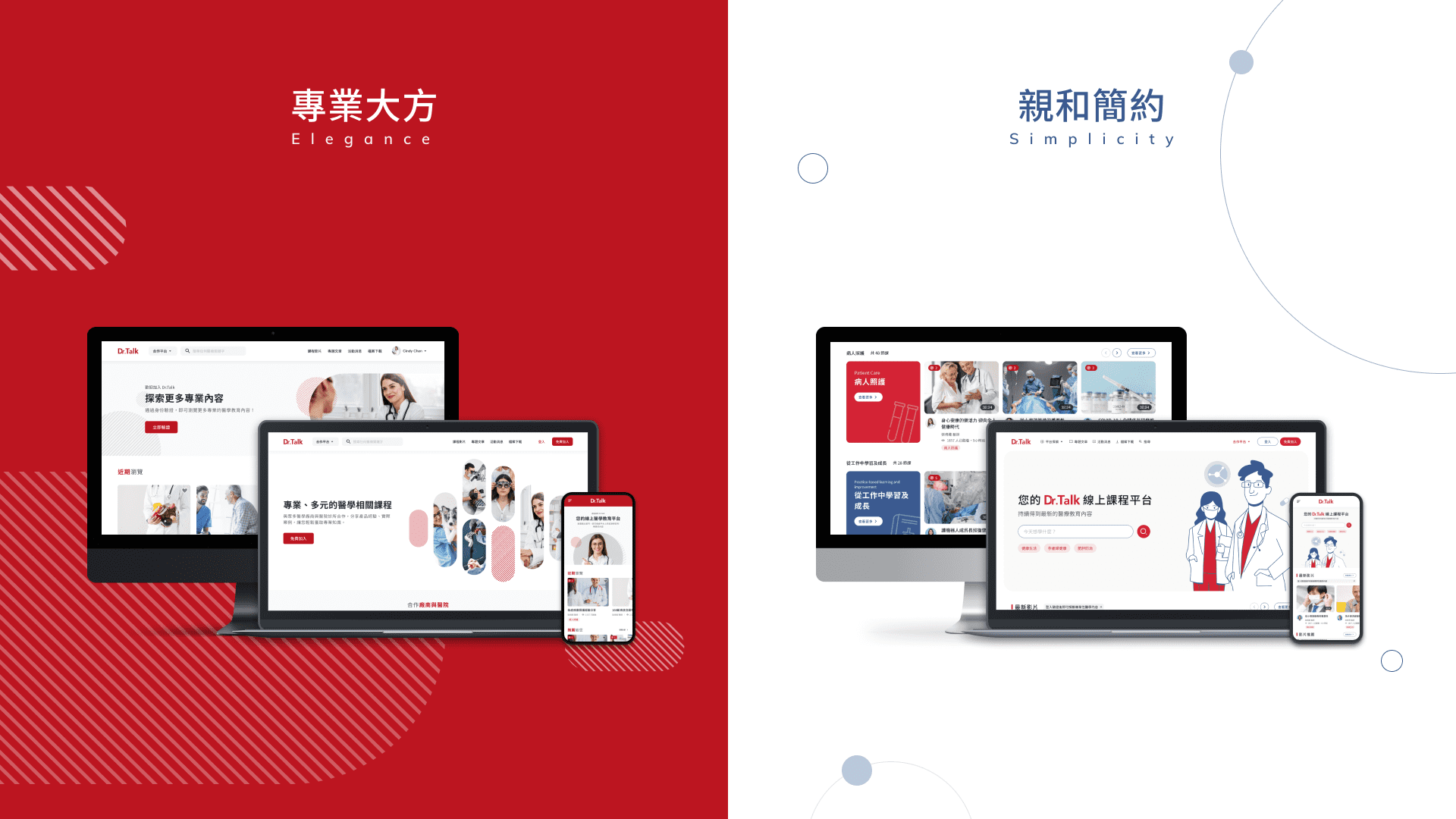
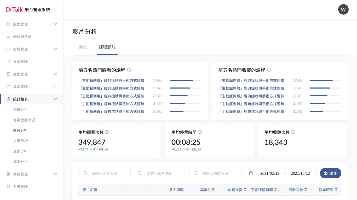
DKSH hopes to redesign the existing online medical learning platform, and looks forward to incorporating lecturers, credits, and charging system in the future to replace the process of physical certification. On the one hand, it can promote medical products, and on the other hand, it can optimize the steps of medical certification.
  • Role
    DesignLead / UX Designer
  • Duration
    10 month
  • Team
    1 PM, 2 Designers, 1 SA, 3 Developer
Pain Points
The original online learning platform has no major problems in interface presentation. The main pain points are:
  • The existing website function cannot meet future needs
  • The entire visual of website gives a more rigid medical impression
User Personas
According to the requirement interviews with stakeholders, we have unified two main user personas, one is the main user in the back-end - the project manager, who is mainly responsible for the maintenance of medical contents on the platform, and the other is the user in the front-end - Doctors, usually have the habit of obtaining medical learning information, or have a need to learn some medical resources.
Our Goal
After requirement interview, pain point analysis, and determination of user personas, our design goal is to Provide customized content according to different roles, shorten the distance between medical content and create an online learning platform that can be easily explored.
Style Proposal
After clarifying the project goal, we provide two visual styles:
"Elegance" uses a combination of blank space, slashes, and light gray to create a clear visual experience, giving people a comfortable and unforced professional visual experience.
The overall image of "Simplicity" strengthens the smooth and approachable image, and reduces the user's feeling of pressure on the medical platform through illustrations. The color use contrasting color - blue to make the whole visual more fresher and have no sense of distance.

In the end, the customer chose "Simplicity", but hoped that the banner should be adjusted to focus on physical pictures with some decorative icons.
Character
For different identities, we have to consider specific content presentation methods and strategies to attract members.

For "Stangers", we focus on the communication of the brand's image, inform stangers our core values and functions, and attract interested users to join members to browse more content.

For "Unverified Members", we hope to provide enough instruction to guide the users to finish verification and browse more professional content.

For "Verified Members", we hope to provide more customized items to let users easily find interesting video content.
Admin Design
Compared with the frontend, the backend design is relatively simple, so we directly follow the style of the frontend to design, and the main function is to provide the content of the frontend.

And the analysis report is one of the important functions that DKSH cares about, we refer to the famous analysis backend systems, such as Google, Youtube, and SimilarWeb.

We focus on the three primary directions to design which are browsing analysis, member usage, and website content orientation.

Analysis Report

Browse Analytics
The key information is presented with cards at the top, and the details of the number of browsing, stay time, and visited pages are presented in charts at the bottom.
Member Usage
Use the pie chart and horizontal bar chart to quickly understand the proportion distribution, and browse the details of each member in the form of a table below.
Video Type Analytics
Browse the ranking of each video category through the bar chart, and use the tabs to quickly browse the ranking status of different categories.
Video Analytics
List the top five videos and various average data to quickly understand the overall browsing status, and browse the details of each video in the form of a table below.

Learnings

This case pays great attention to the content by different roles. For UX, it is necessary to examine the same screen from more than 3 angles to see if there are concerns, which also makes me more careful about the permission control on each screen.

I have had deep discussions with SA during this project to investigate each report, like the data resource and feasibility, and I realize more about how the data on the websites are recorded.

Next Work

CEC Cloud Manage System

UI UX Design