99%
Ch
UI/UX Design

Cathay Health Reservation Platform

Overview
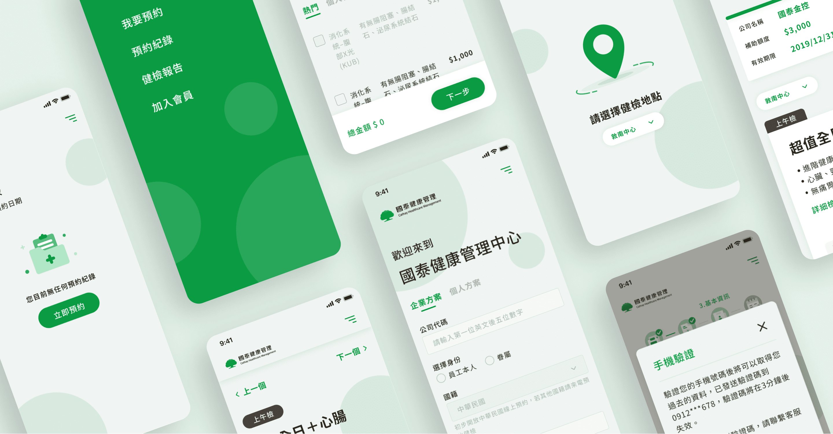
Cathay Health Management Center focuses on comprehensive care, high-quality and safe inspection environment, complete equipment and professional medical team. They hope to build an appointment platform that can make users feel warm and relieve tension during operation.

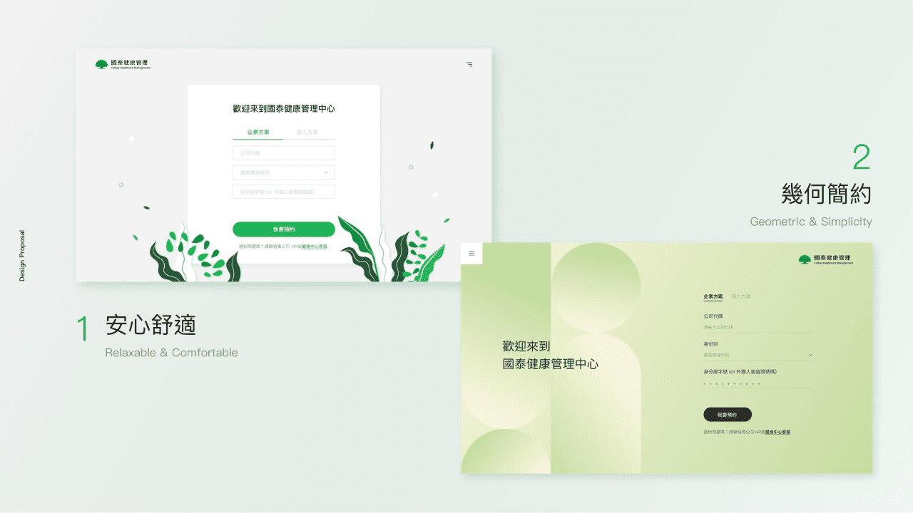
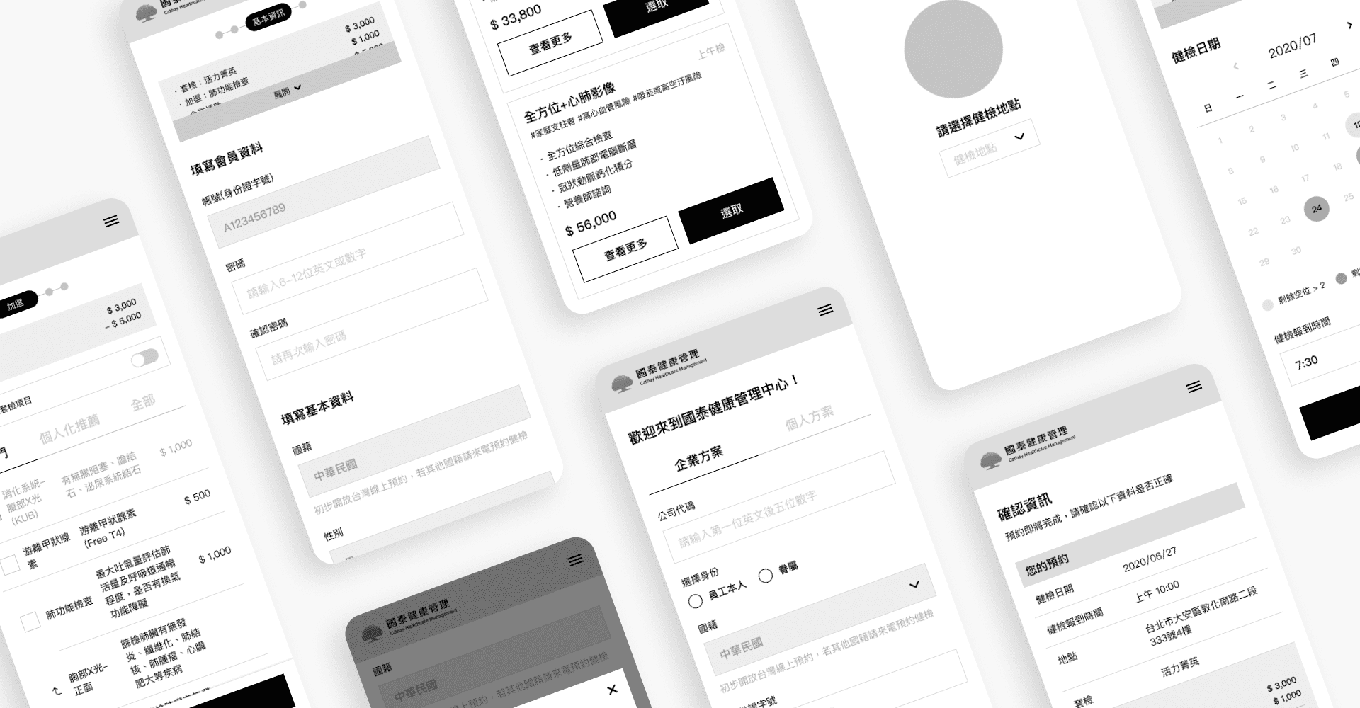
Because Cathay originally wanted to design the app system first and then connect with the website, we first made a design proposal for the app, and after confirming the takeover, we found out that Cathay had a rough wireframe and hope to design the website first. So they hope we will continue to complete the wireframe details, UI flow, and GUI design.
  • Role
    UX Designer
  • Duration
    4 month
  • Team
    1 PM, 2 Designers, 1 SA, 3 Developer
Challenge
Since the back-end of this project is connected to the old system of Cathay Health Management Center, and the Api was provides by the middle platform which is designed by Cathay's internal programmers, so seriously, we belong to Party C, because we cannot directly contact the Cathay Health Center, which leads to great difficulties on communication. And the UX design needs to be affected by the limitations of the old system and the middle platform.
Style Proposal
The previous style of the App proposal was "Plant Healing". After the kickoff, our UI designer also provided another style for Cathay to choose.

"Relaxable & Comfortable" mainly focuses on relaxing green plants, thereby reducing the user's nervousness about the health check and making the user feel at ease during operation.

"Geometric & Simplicity" uses geometric figures as the basis for typography to achieve different visual movement lines and reading experiences, and through gradient colors to create a lively sense of change.

The process of style proposal went back and forth several times. In the end, the client chose to focus on the "Relaxable & Comfortable" version, but removed the plant illustration and replaced it with a simple circle for embellishment.
UI Flow
Since Cathay has provided a rough wireframe, but this plan has only a positive process, so I am mainly responsible for discussing with the client based on the correctness of the process and smooth experience under the original plan.

Then cooperate with the program logic planned by the middle platform, adjust the screen generated by Flow according to the program judgment, and finally discuss with SA and add the screen generated by the wrong situation to complete this UI Flow.

Learnings

There are many situations that need to be considered in the health check appointment, so I added the diamond-shaped mark of the Flow Chart when drawing the UI Flow to unify different situations and ensure that all situations are considered.

Although we belong to Party C, and the process planning must be limited by the middle-end programming, but also because of this, I can understand the impact of program restrictions on the process more deeply, which allows me to think more about what developers care.

Next Work

Dr.Talk Online Learning Medical Platform

UI UX Design